Crush
Crush

Type: Location-based dating app (MVP, Startup)
Tools: Figma, Miro, Jira, Slack, Notion, Maze, Google Analytics
🧩 The Problem
Despite being surrounded by people at social events, many still struggle to make the first move. Dating apps are flooded with passive swipers, ghosting, and endless chatting that rarely leads to real-life interaction. I wanted to flip the script.
How might we encourage people to act on real-world chemistry — in the moment — without the friction of traditional dating apps?
🎯 The Goal
Design a dating app that only activates in real-time, real-life environments (e.g. parties, events, bars) to help users connect with people already in the same space.
🧑💼 My Role
As the Lead UX Designer and Co-founder, I was responsible for driving the product vision from a human-centered lens, translating ambiguous ideas into concrete flows, and ensuring the end-to-end experience supported our goals for behavior change.
My responsibilities included:
Leading design research and synthesis
Designing UX flows, UI systems, and interaction models
Prototyping and conducting usability testing
Collaborating with co-founder(s) on roadmap prioritization
Shaping go-to-market plans and monetization experiments
Presenting product strategy in incubator pitches and user trials
Go ahead, find your Crush.

The first official logo of Crush
🔍 Research Highlights
I led mixed-method research including:
20+ user interviews at social venues, parties, and college campuses
Online surveys with early users
Competitive and analog audits (e.g. speed dating, party culture dynamics)
What users told us:
"I’m not shy, I just don’t know if they’re into me."
"I’d talk to someone if I knew they were on the app too."
"I don’t want to message forever — I just want to know if there’s interest right now."
The first version of the Crush.
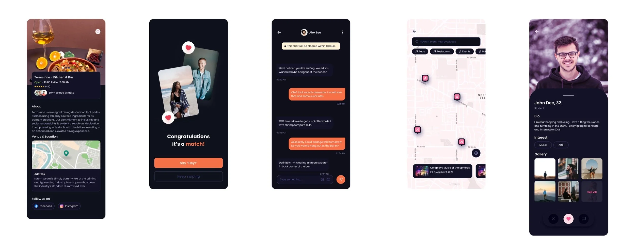
🔄 Key Takeaways from the First Version
After launching the initial MVP of Crush, we gathered feedback from over 20 users during beta events. While the app successfully demonstrated core functionality—proximity-based matching and limited-time chats—we identified several key issues:
Outdated Visual Design: Many users described the interface as feeling "like an old Android app from 2010." The color scheme, typography, and visual hierarchy lacked the polish and modern appeal users expected from a dating product.
Low Visual Retention: Users would often swipe or match but didn’t stay long enough to explore the chat or premium features. The design didn’t visually encourage continued interaction or return usage.
Lack of Emotional Connection: Despite the IRL-inspired concept, the UI didn’t reflect the energy or vibe of real-world venues. It felt sterile compared to the emotionally resonant experience we envisioned.
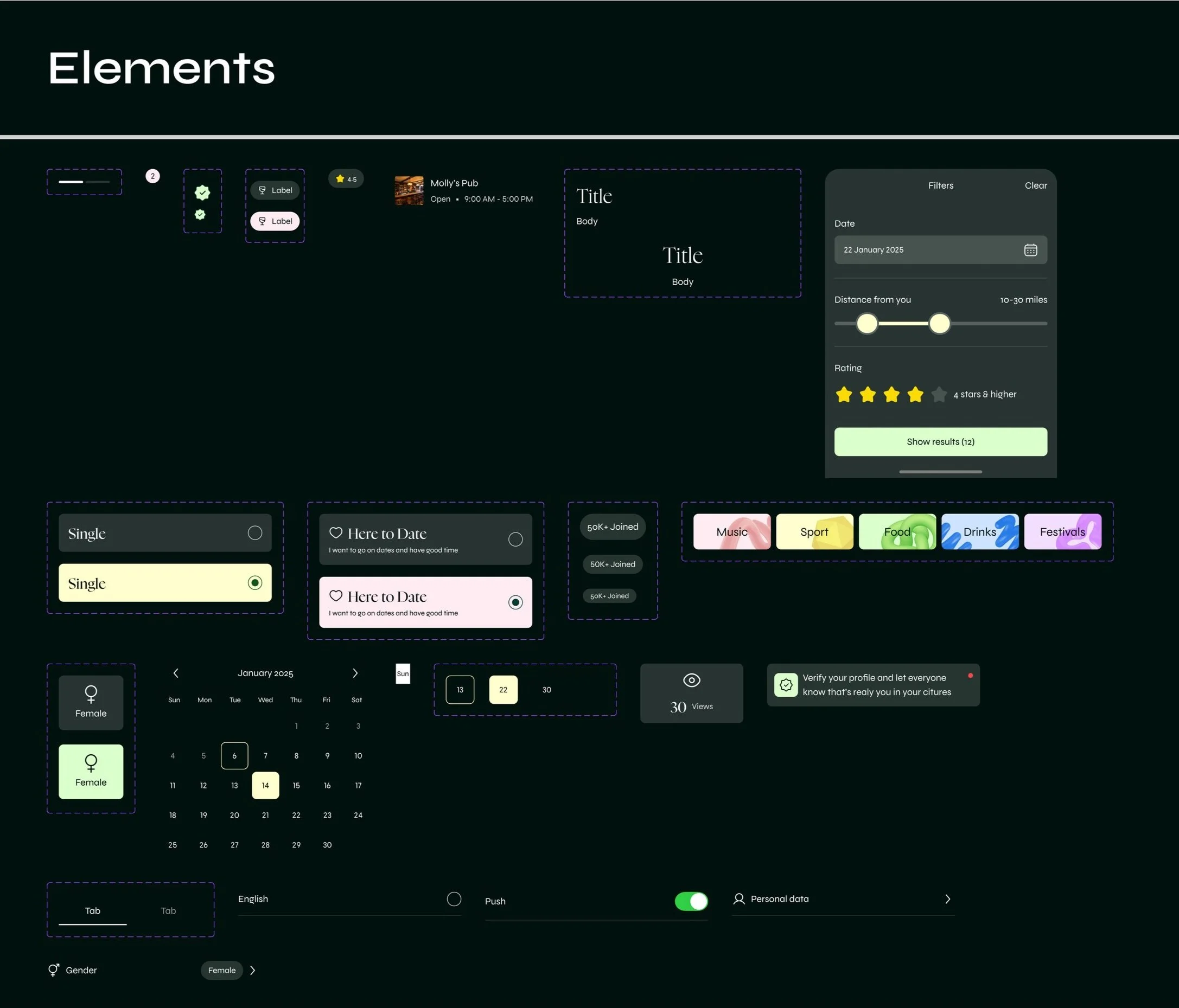
✨ How This Informed the Rebrand
These takeaways became a driving force for the redesign. We prioritized visual clarity, smoother microinteractions, and a stronger emotional tone across the app experience:
Modern Aesthetic: We overhauled the UI with a bold, fresh design system—cleaner typography, vibrant yet balanced colors, and better use of space to bring warmth and modernity to the interface.
Interaction Design: The swipe deck, profile modals, and chat flows were refined with improved animations and better touch affordances, enhancing usability and emotional stickiness.
Brand Tone: We aligned visuals and copy with the brand’s mission—helping users seize real-life moments—by making the app feel like an extension of a fun, in-person vibe rather than just another dating interface.
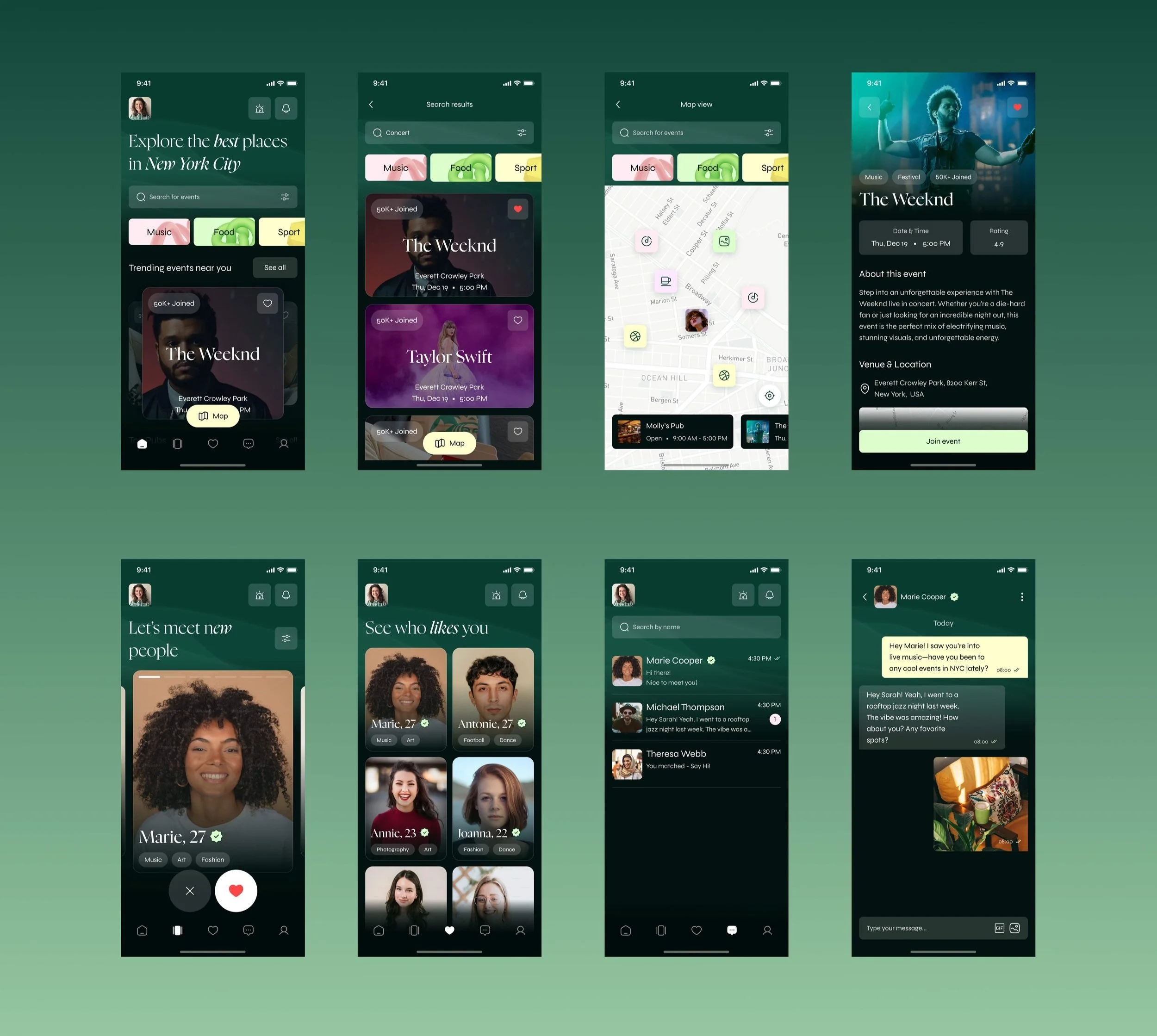
The result was a sharper, more emotionally resonant version of Crush that encouraged deeper engagement and reflected the spontaneity we aimed to capture from real-world interactions.
🧠 Key UX Strategies
Urgency through time-limited matches
Matches auto-expire in 30 minutes unless users act — creating natural pressure to connect IRL fast.Real-world activation via proximity triggers
App only activates when users are within specific Bluetooth or WiFi zones (e.g., a party or venue), avoiding passive swiping from home.Behavioral monetization
Features like “Super Swipes” and “Chat Extensions” were offered contextually to nudge meaningful action during brief, high-stakes windows.
📈 Impact
MVP launched in under 4 months
Acquired 100+ users via local event partnerships, without paid marketing
Saw 17%+ match-to-conversation activation rate in real-time zones
Informed future monetization strategy with in-product experiments
Presented product in pitch decks and incubator applications
💭 What I Learned as Lead UX Designer
Behavioral nudges — not just features — drive IRL action
Emotional UX (urgency, mutual awareness, social proof) outperformed gamified mechanics
Proximity-based design can change how users behave inside physical environments, not just on their screens


Web PortalS
We created a web portal for various establishments to register their places and host events. We simultaneously also made an admin portal for the app to manage all the events being registered and go through admin approval.

Business portal


Administration portal
THE FINAL PRODUCT


Crush is now live on all major app and play stores across the U.S., having recently secured $250K in funding with additional investor interest continuing to grow.
HOW IS CRUSH NOW?
🌟 Why It Matters
As Lead UX Designer, I wasn’t just shipping screens — I was defining product behavior. I’m passionate about designing tools that shift human interaction patterns in positive, thoughtful ways. Crush showed me how UX can engineer courage in the right context — helping people meet in real life, not just swipe for dopamine.